Larry Wilmore, host of the new "Nightly Show," which features an upside-down, non-Mercator map. (Image via imgur)
Helpful Twitter users to new host: "Your map of the world is upside down."
But is it a political statement?
There have been a few big shakeups in the world of comedy news lately — both in terms of who's sitting in the host's chair, and what's hanging on the walls behind them.
 Larry Wilmore, host of the new "Nightly Show," which features an upside-down, non-Mercator map. (Image via imgur)
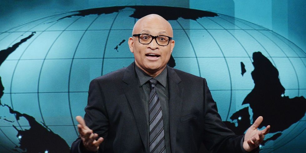
Larry Wilmore, the longtime "Senior Black Correspondent" for Jon Stewart's "Daily Show," premiered as the host of Comedy Central's "The Nightly Show with Larry Wilmore" on Monday night, replacing outgoing comic Stephen Colbert's "The Colbert Report."
Stewart and Colbert, Comedy Central's mainstay joke newscasters, both sat in front of fairly standard newsroom decor: Stewart in front of a Mercator projection map of the world, Colbert in front of swirling blue graphics reminiscent of Fox News.
But look behind Wilmore, and you'll see a map that appears to be non-Mercator and upside down.
@larrywilmore My wife, Shelly noticed that your map of the world is upside down behind you....is this on purpose?.....just wondering.
— chris m. (@cmarch383440) January 22, 2015Day 3 of @nightlyshow and the map behind @larrywilmore is still upside down...
— Zack Smith (@whtrice123) January 22, 2015Unlike the usual newscaster background maps, Wilmore's map doesn't show much of Europe and Asia (they're mostly covered by his body) and North America fades away in the bottom-left corner, while Africa and the Arabian Peninsula feature prominently over Wilmore's shoulder.
The debate over map projections is an old one.
The Mercator projection dates to the 1500s and was valued for its use in navigation, but many rightly pointed out that the map enlarged the northern hemisphere, making Canada, Russia, Europe and the Arctic look far bigger than they really are.
 A Mercator projection world map. (Image via Wikimedia Commons)
The Gall-Peters projection was widely proposed as a replacement in the 1970s and 80s — the map was even featured on an early episode of "The West Wing" — because it fixes the northern hemisphere stretching.
 A Gall-Peters projection world map. (Image via Wikimedia Commons)
Why would Wilmore use a map that appears to be both Gall-Peters and upside down?
Perhaps it's a statement against "Euro-centrism."
Love that Larry Wilmore has an upside down map. It gives props to the Global South/Majority World. That's pretty bold & radical thinking...
— Talia Whyte (@taliawhyte) January 20, 2015Proponents of the Gall-Peters projection map argue that the old Mercator projection skews perceptions about the world, making Europe seem more important than it should be by enlarging it and putting it in the center of the map.
Of course, no map is perfect — just look at this map showing country sizes based on their populations to see how misleading area maps can be.
As for being "upside down," while a "north is up" map is what most Americans might be used to, some make the case that there's nothing categorically "wrong" about a "south is up" map.
“The impulse is to say the map is ‘upside down,’ but of course it’s not–there is no up and down in space” https://t.co/sC08oSOzJj
— Matt Dusenbury (@MattDusenbury) January 20, 2015Wilmore does not seem to be answering the questions pouring in on Twitter about his map choice, but he's not alone in choosing non-traditional images for his show.
John Oliver, another "Daily Show" alumnus, sits in front of an eclectic cityscape during episodes of his HBO show "Last Week Tonight."
The skyline image features Egypt's Great Pyramid of Giza, Jerusalem's Dome of the Rock and a number of modern skyscrapers all crammed into one multicultural cityscape — and just as Wilmore's map puts Africa in the spotlight, so too does Oliver's image highlight the non-Western world, unlike the Europe- or North America-centered maps of traditional newscasts.
—
Follow Zach Noble (@thezachnoble) on Twitter


