Image via Pew Charitable Trusts
Where are people working?
Where the money is — federal money, that is.
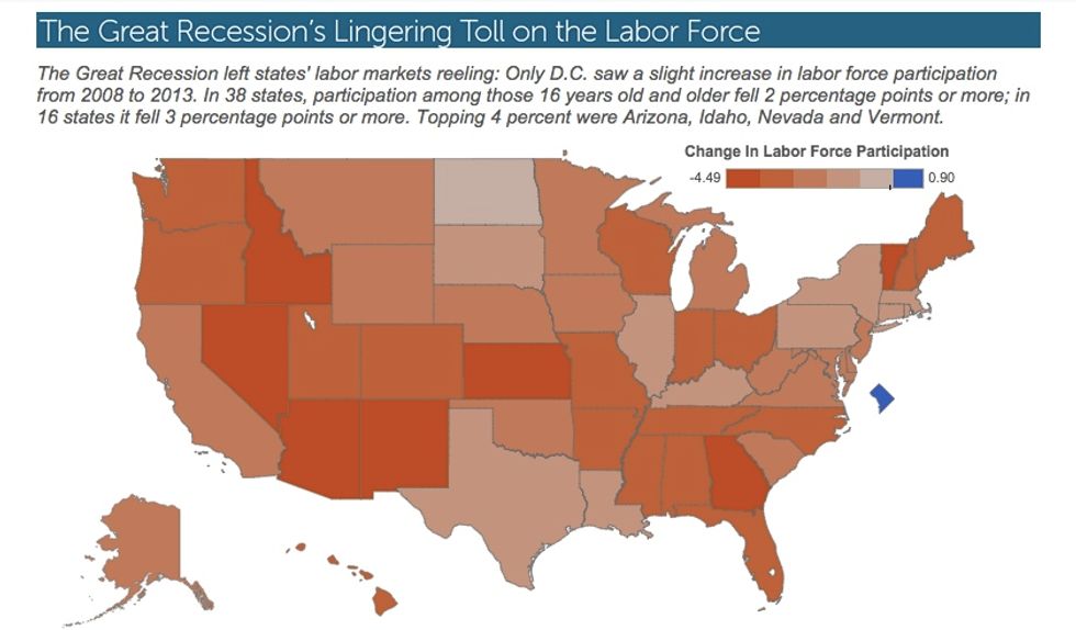
In a Friday map series published by Pew Charitable Trusts' Stateline blog, analysts lay out the state of labor force participation — how many people who could be working are actually working or trying to get a job — and reveal how dismal the situation has been between 2008 and 2013.
Nationwide, the labor force participation rate plummeted, reaching lows not seen since 1978 and undermining future claims that the jobs situation is improving.
Only one region saw labor force participation rise: Washington, D.C., seat of the federal government.
 Image via Pew Charitable Trusts
Only in the nation's capital did the ranks of workers actually swell compared to the rest of the population.
Check out Stateline's full map series below:

—
Follow Zach Noble (@thezachnoble) on Twitter