© 2026 Blaze Media LLC. All rights reserved.
The next time you crack open a Diet Coke, pay special attention to the can — something has likely changed.
The Coca-Cola Company has started rolling out a new universal can design in various markets as part of an attempt to solidify a "single brand."
In the U.S., the change means that the "Diet Coke" and Coca-Cola Zero" words are spelled horizontal on the can. Previously, the words were spelled vertically.
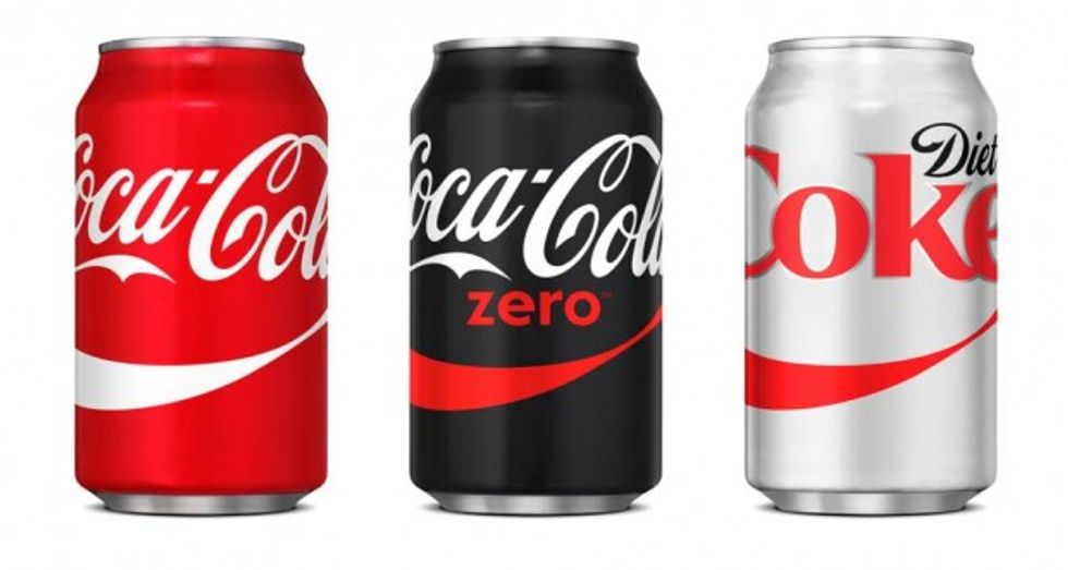 Image source: Coca-Cola via New York Daily News
"We’re focusing on packaging design in 2015,” a spokeswoman told the New York Daily News. “Other aspects of the pilot strategy and testing will be explored based on global learnings and U.S. business results.”
The company echoed that to AdAge, saying the U.S. will be "taking a test-and-learn approach."
"We're focusing on packaging design in 2015, and other aspects of the pilot strategy and testing will be explored based on global learnings and U.S. business results," Coca-Cola told the website.
In Spain, the packaging is radically different. Diet Coke was renamed to "Coca-Cola Light" and all cans featured very similar designs that included a red background.
(H/T: New York Daily News)
—
Follow Oliver Darcy (@oliverdarcy) on Twitter
Want to leave a tip?
We answer to you. Help keep our content free of advertisers and big tech censorship by leaving a tip today.
Want to join the conversation?
Already a subscriber?