© 2026 Blaze Media LLC. All rights reserved.
When I think about the long and storied history of political propaganda, the first thing that comes to mind is Fred Spear’s Enlist poster from World War I, which depicts a mother and child drowning in the Lusitania incident. An incredibly powerful image, it supposedly solved America’s recruiting crisis and mobilized the nation to fight the war . . . before being pulled from circulation for being “too sad.” Other greatest hits include Uncle Sam, Rosie the Riveter, and, of course, the Soviet and Nazi propaganda posters we’ve all seen in history books. Then there’s the long history of political illustrations and cartoons—Join or Die, the Appeal to Heaven flag, Boss Tweed and Tammany— that occupy our collective memory when we think of political propaganda.
These forms of propaganda are generally well respected, and their creators are regarded among the great artists in American history. Far less studied and often forgotten is the art of campaign propaganda for specific politicians. Lawn signs, campaign slogans, pin designs . . . all the stuff tied not to a point but to a person. Unlike the more glorious forms of propaganda, candidate-specific advertising is not just the redheaded stepchild of political marketing, but of marketing in general.
That is, until relatively recently.
The Campaign as Art
 The warm glow of Zoomer colors, halal cart aesthetics, and the promise of free stuff.Mamdani Campaign
Candidate TV ads are poorly conceived and composed. They appear on local broadcasts and make us cringe; they’re inherently depressing in the same way microwave dinners are. They look and feel cheap and pandering, fundamentally mediocre and uncreative. Political ad creators are seldom connected with the rest of the oh-so-prestigious remainder of the ad industry, which (correctly) looks upon the political sector as untalented bottom feeders. The exceptions—like Reagan’s famous Morning in America ads—are taught in ad schools with grudging necessity.
Political ad creators, in turn, view the rest of the ad world as silly poseurs, failed artists—people trying to make Snickers ads into Picassos. Political ad people, like every other sort of DC person, are notoriously catty gatekeepers: they have their arbitrage scheme cranking out incredibly mediocre work for eye-poppingly high fees, and they make it virtually impossible for outsiders to break in. Which is why top-end campaign art, even today, usually still looks and sounds like this:
 The ‘60s epitomized political aesthetics off the assembly line.Library of Congress
Hope and Change
Before Obama, campaign logo designs were mere afterthoughts. Even some of the memorable historical examples—“I like Ike,” “Just Bill,” and “Jeb!”—were consciously or unconsciously tongue-in-cheek, as if to say, “we all know it’s ridiculous, but we have to do this.” For centuries, campaign designs for both winners and losers were ultra simple, borderline identical, just red, white, and blue with the name in black. Perhaps a holdover from our Puritan roots, it was as if dolling things up with details would undermine the purity of the politician’s heart. Obama’s branding breakthrough was still somewhere over the rainbow.
It genuinely wasn’t until Obama’s 2008 campaign that the political campaign itself became a canvas for design messaging and visual innovation. Shepard Fairey, the street artist behind the OBEY campaign, made the famous HOPE poster that changed the game. But it wasn’t just that. The Obama campaign tweaked the typical, boring red, white, and blue for a brighter sky blue and a more palatable red, with fonts now featuring more rounded, childlike edges. For the logo, a big friendly blue “O” was bisected by the stripes of a flat-laid flag, evoking fields of wheat in a cartoonish reference to America's pastoral roots. The whole thing felt very Disney.
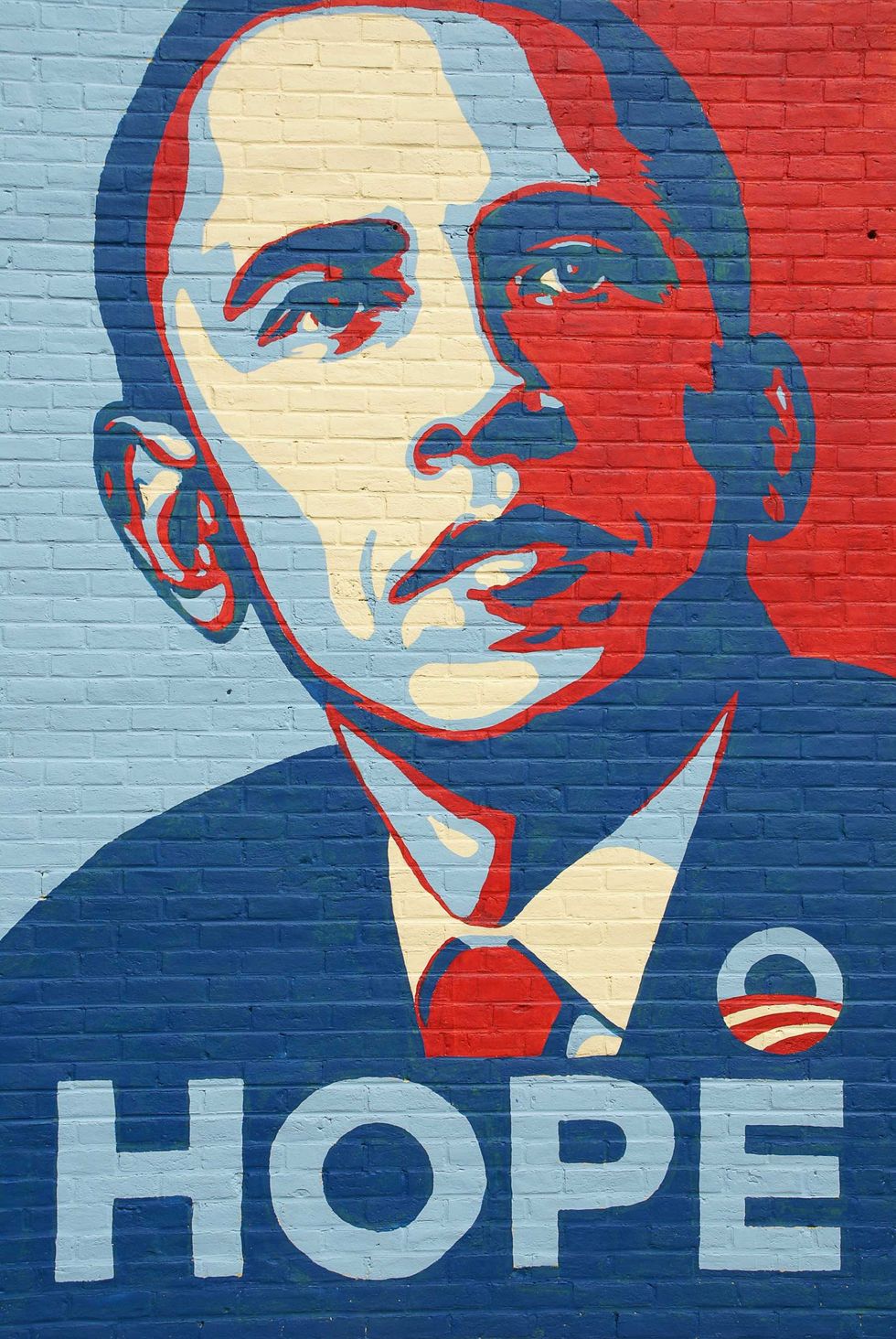 Shepard Fairey’s fairy tale.
It was beautiful in its simplicity, and even today, looking back, you can feel its innocence and the naïve country’s guilelessness that fell for it. In a more cynical world, we can say things like, on a long enough time scale, all logos will be compared either to a swastika or an asshole. A cross or a circle. Cross logos are masculine, circle logos are feminine. And nothing represents more of a circle than the perfect circle of that Obama logo.
The Obama campaign design opened up the medium to feel more digestible, more “for everyone”, brighter, and more hopeful. More open to experimentation. This sounds super obvious, but if you look at the drabness of Clinton’s, Gore’s, or, needless to say, Bob Dole’s or John McCain’s campaign art at the time, escaping the confines of boringness was a more radical move than it may have appeared to be. And this, of course, opened up the door to the polar opposite of Obama’s circle-y, friendly Disneyness: the bright, stinging red of Make America Great Again.
Resistance Red
The Republican Party in America used to be blue, which makes sense as a counter to communism, always and forever represented by red. But, like communists who always view themselves as radicals, the Right in America became increasingly the same sort of thing, increasingly “out of power,” the heckler’s veto shouting at the ever-leftward-slouching globalist Cthulhu. The American Right’s reluctant embrace of red reached its pinnacle with Trump. The purest manifestation of “Make America Great Again” was a rigid, angular, totally no-nonsense, all-caps serif printed on a simple nautical rope hat that erased and dismantled the incredibly soft and annoying legacy of Obama’s Shepard Fairey-designed HOPE posters.
And that was 2016. Nothing for eight years until . . . yes, Mamdani.
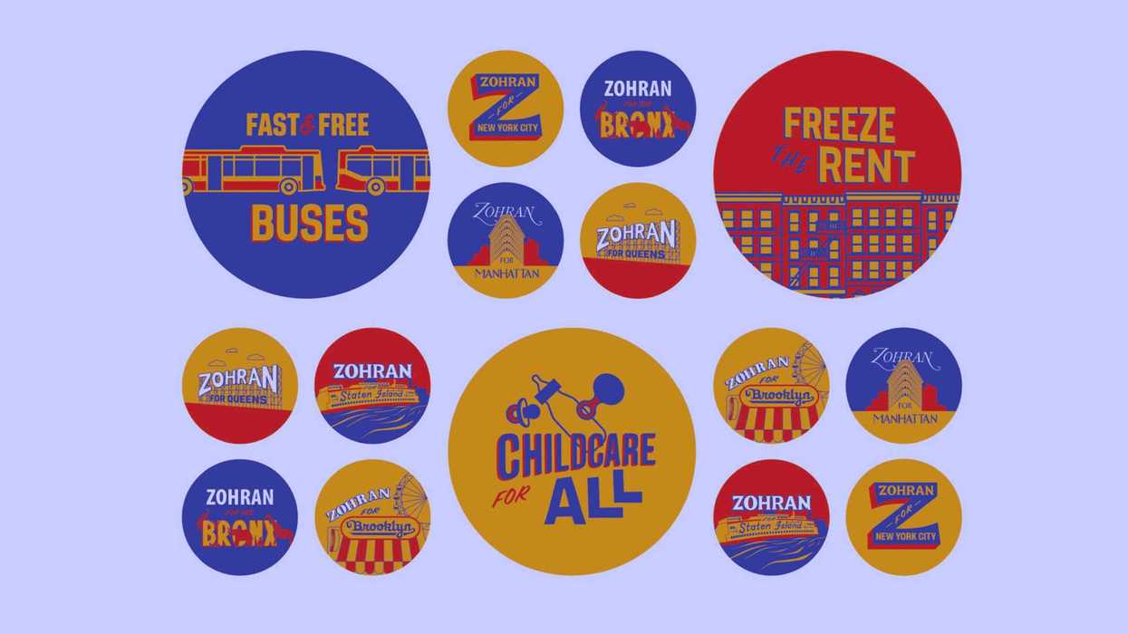
Third World Aesthetics
 Mamdani Campaign
Well, not actually nothing. Let’s first consider Kamala’s complete-failure Brat campaign, a 1:1 ripoff of hipster UK pop star Charlie XCX’s puke-green, Helvetica-worshipping album design. Kamala’s utterly deficient inner circle included the owner of a brand agency, who, like Kamala herself, had clearly been the recipient of several lifetimes of DEI hiring. To be fair, you have to respect the guts of such a move—that is, of making your campaign puke green and referential to a parasocial sleaze—but like everything in the Kamala campaign, incompetence was often mistaken for originality. In any case, we saw how that turned out.
But then along came Mamdani. His campaign designs aren’t just good. They’re insanely good. Striking. Carefully considered. Genuine. Very much not tongue-in-cheek. In branding, I always encourage my creatives to use unexpected yet familiar references, like the warning text on a plane exit or the standard end credits of a movie, because people are titillated by nostalgia, particularly nostalgia they’re unaware of until it awakens them from their slumber. And Mamdani pulled this off perfectly—he leaned into the Sabrett street-meat umbrellas—almost an afterthought to New Yorkers who are so used to them they barely know they’re there, combined with warm, crayon-like tones and the ‘70s-retro shadowed text of a Brooklyn record store. It led to a weighty, striking brand presence that felt both familiar and totally unexpected; a combination that always sparks the alligator brain to pay attention.
And look at the competition. Andrew Cuomo, who sources told me was sure to lose early in the campaign season, decided to switch up his campaign logo and design halfway through to compete with Mamdani, going from utter shit to ut-ter shit. (If there was ever something created with a single prompt in ChatGPT, it’s this. It’s supposed to be some vague reference to the Statue of Liberty, but what else? Why is it orange?)
Despite being the ultimate Third Worldist, Mamdani is responsible for the far less Third Worldist logo, in the sense that his looks like it was made by hyper-talented SCAD graduates. Cuomo’s, on the other hand, looks like a couple Pakistani guys made it on Fiverr. It is completely devoid of anything besides the most superficial effort and vision. While Mamdani produces something considered, crafted, referential, and yes, beautiful, Cuomo barely lifts a finger. But tongue-in-cheek laziness doesn’t work anymore
Want to leave a tip?
We answer to you. Help keep our content free of advertisers and big tech censorship by leaving a tip today.
Want to join the conversation?
Already a subscriber?