Image via RBC Capital Markets/Business Insider
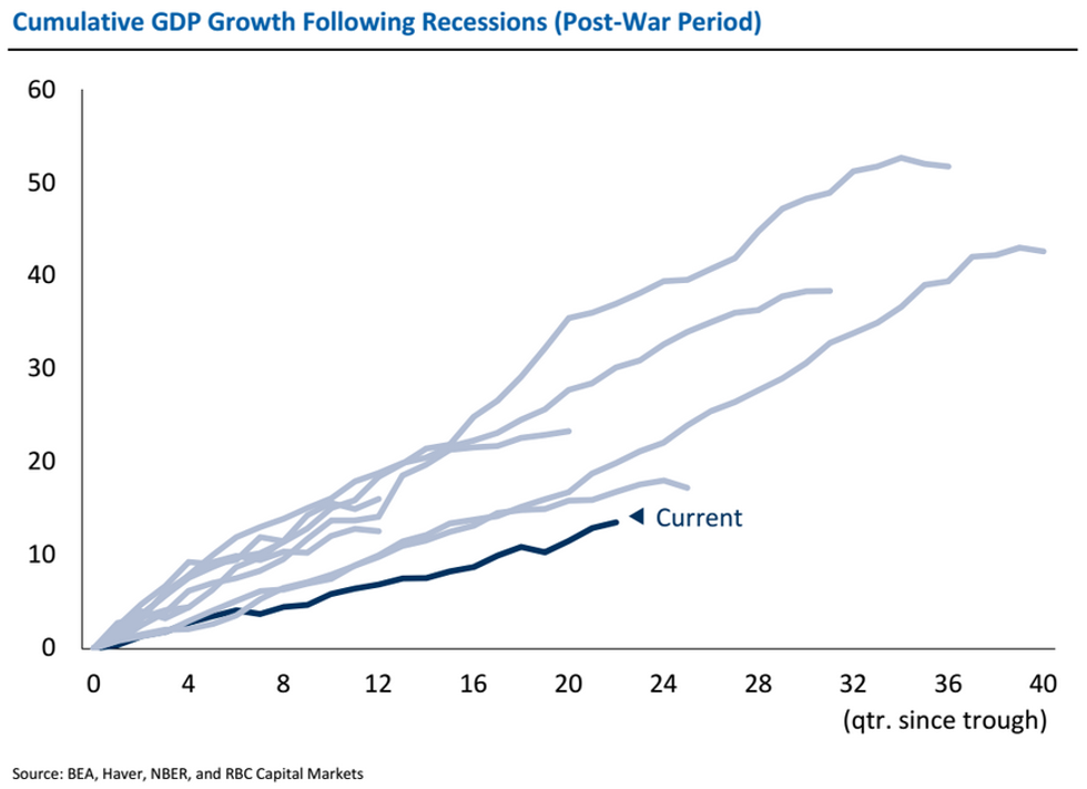
Need a reminder that the ongoing economic recovery isn't much to be excited about?
You could look at weak wages, disappointing jobs numbers or a labor force participation rate at a 40-year low — or you could just take a look at one telling chart.
Typically after a recession, the American economy registers recovery with strong GDP growth, but the latest recovery continues to be the weakest since World War II, as Jonathan Golub, the chief U.S. market strategist at RBC Capital Markets, shows in the graph below.
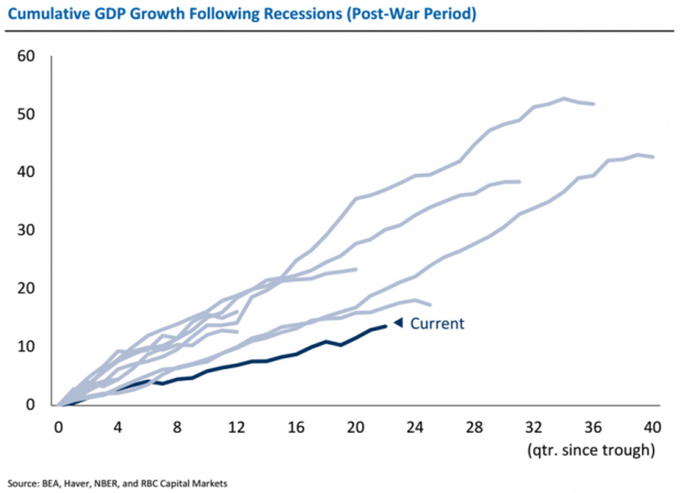 Image via RBC Capital Markets/Business Insider
As Business Insider's Myles Udland put it, "[T]his recovery really stinks."
—
Follow Zach Noble (@thezachnoble) on Twitter