© 2026 Blaze Media LLC. All rights reserved.
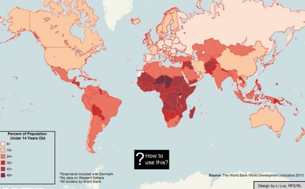
Consider this map your guide to the future of humanity.
 (Image via Radio Free Europe)
Published by Radio Free Europe/Radio Liberty on Wednesday in anticipation of World Population Day, the map above shows the huge age differences between the developed and developing worlds.
In Europe, Japan, China and the U.S., less than 20 percent of the population is under the age of 14.
That percentage is low by the rest of the world's standards.
In Brazil, 1/4 of the population is under 14.
In Pakistan, 1/3.
In Niger, more than half of the population is under 14.
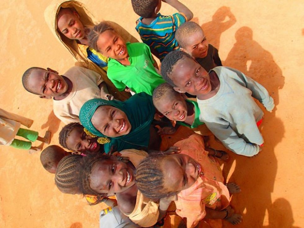 Children in Niger. (Image via European Commission DG ECHO/flickr)
What's the significance of ages?
In 20, 30, 50 years, the countries with large percentages of young people will have grown dramatically — while the nations with smaller percentages will be shrinking.
The negative impacts of low birthrates are plaguing such nations as Japan, where a rapidly aging population is straining social safety nets and leaving Japanese wondering whether their country will survive into the next century, and Russia, where more people were dying than being born each year for more than a decade — a trend that the Russian Federation has recently reversed, but only barely.
While Russia, Japan and the European Union wonder if they have a future, the nations of Africa, Southwest Asia and South America have a very different outlook: They know the future belongs to them.
Explore the interactive version of Radio Free Europe's map below:

—
Follow Zach Noble (@thezachnoble) on Twitter
Want to leave a tip?
We answer to you. Help keep our content free of advertisers and big tech censorship by leaving a tip today.
Want to join the conversation?
Already a subscriber?