One of the most familiar logos on the Web is getting an update.
Google announced Tuesday that it is making some artistic changes to its iconic primary-colored logo.
 Image source: Google
Though Google's logo has changed five — now six — times in nearly two decades, its logo has looked pretty similar for a while now, with just some minor adjustments over the years.
"So why are we doing this now?" Tamar Yehoshua, vice president of product management, and Bobby Nath, director of user experience, wrote in a blog post. "Once upon a time, Google was one destination that you reached from one device: a desktop PC. These days, people interact with Google products across many different platforms, apps and devices—sometimes all in a single day. You expect Google to help you whenever and wherever you need it, whether it’s on your mobile phone, TV, watch, the dashboard in your car, and yes, even a desktop!
 Getty Images
"Today we’re introducing a new logo and identity family that reflects this reality and shows you when the Google magic is working for you, even on the tiniest screens," the post continued. "As you’ll see, we’ve taken the Google logo and branding, which were originally built for a single desktop browser page, and updated them for a world of seamless computing across an endless number of devices and different kinds of inputs (such as tap, type and talk)."
Check out this video to see the evolution of Google:
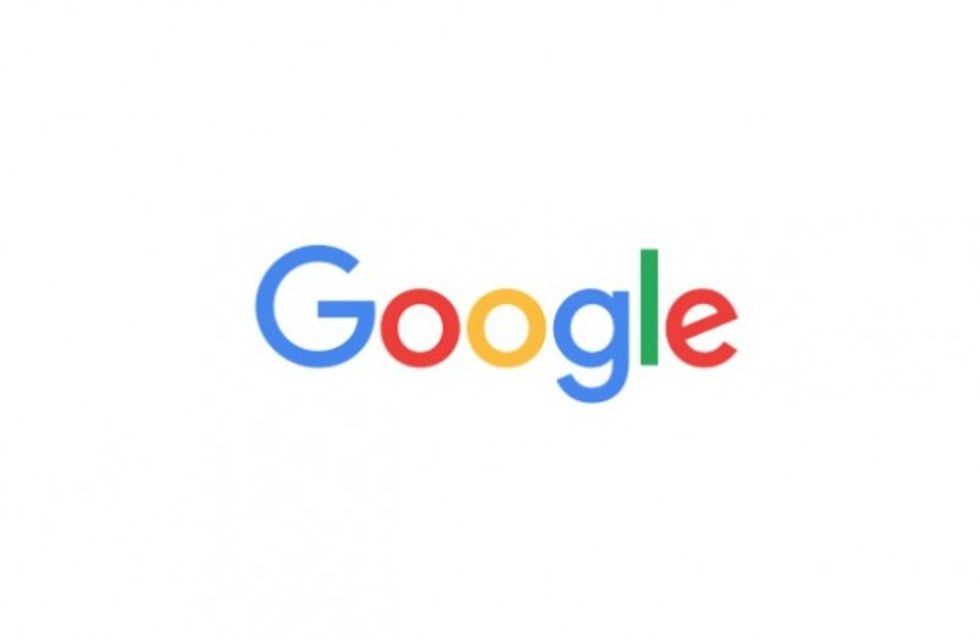 Image source: Google