
da-kuk/Getty Images
According to Gallup, 65 percent of U.S. adults believe the coronavirus situation is getting worse. On the bright side, given the unanimity of opinion embedded in the incessant media coverage playing on panic and fear – the worst human emotions – it's surprising that number is not closer to 100 percent. On the downside, the media is driving politicians to destroy this country based on a demonstrable lie.
From listening to the mindless tropes from fact-free media headlines, one would think that all the Southern states are now at least as bad as New York was in March, if not worse; that the virus is intensifying; that it's all taking place in states that didn't lock down properly or long enough; and that the virus re-emerged because lockdowns were lifted, despite the funny timing of this "surge." As such, only indefinite lockdowns can save us.
In fact, most of the surge is superficial and illusory, built on numerous accounting gimmicks. In addition, the virus is weakening more than ever; even the worst states are better than New York was; the superficial surge affects the states that were never hard-hit – both lockdown and non-lockdown states alike; the timing does not coincide with the reopening but with other factors; and the biggest factors driving it – border medical tourism, illegal alien agriculture workers, and possibly rioters – are completely ignored by the same people who are screaming "Coronavirus!" in a crowded theater.
For now, let's focus on the myth that the recent surge states are anywhere near as bad as what occurred in the Northeast in March/April, an assertion that is perpetuating the myth that the virus is somehow getting worse.
If you are willing to ignore the superficial factors of increased testing and changes in counting methodology, all but the Northeast and several other states are experiencing an increase in cases, not just the South and not just states that reopened early. However, this is not a massive surge. Here is a presentation of what the trend line of cases would look like had we been doing this amount of testing all along.
There is a little community spread, as I've theorized in the past, due to Mexican border travel, migrant workers traveling from state to state during crop-picking season, and very likely from the estimated 26 million protesters. We're not seeing the effects in the Northeast. But ask yourself this question: Would you rather have been a Northeastern state in April or in a recent "surge" state?
The reason why the Northeast is pretty much done with the virus was not born out of something positive. They likely achieved de facto herd immunity only after experiencing a lot of deaths. What the other states are experiencing is a true flat curve – it lasts longer but results in many fewer deaths, especially now that they are experiencing the cases when the virus has become milder and targets healthier people. The media is making it seem like the Northeast is good and the South and West are bad. Let's take a look at the two groups of states – surge and non-surge – and ask yourselves which group you would you rather be in.
Here are easy-to-read charts courtesy of a brilliant mathmetician I've gotten to know in recent days. The first chart is the trend line of the non-surge states, mainly in the Northeast. Take a look at how high the scale of deaths is.
Now look at the "surge" states over which the media is panicking:
Which one achieved more of the original goal – to live through the virus with a flatter curve? The answer is obvious to anyone who is intellectually honest.
Now let's put the two together – the original Northeastern states vs. the current "surge" states:
Which group of states would you rather be? The blue group, which experienced their cases when the virus was more deadly and with governors who killed people in nursing homes? Or the states that are experiencing a later, milder hit?
Here is a remarkable presentation of the panicked surge in cases, completely divorced from an epidemic of fatalities:
During the first wave, New York was the biggest hot spot. Now, Arizona is considered the biggest hot spot. But if you are looking to equate the two, you will be disappointed. Which state would you rather be?
Now examine this presentation of New York cases and deaths vs. cases and deaths from California, Arizona, Texas, and Florida. Look at all the cases those four states have and how few deaths they are suffering.
I guess the media thinks that the Northeastern states flattened the curve. Well, having everyone who is vulnerable to the virus die in nursing homes is one tragic way of flattening that curve! Take a look at this shocking comparison of the six states that placed COVID-positive patients into nursing homes to the other 44 states.
If you lump together the other 44 states, what you basically get is a flat curve – where we only experienced epidemic levels of death for six weeks, and not by much. Thus, the entire epidemic – over and beyond a typical bad flu season – essentially boils down to a case of panic pornography that led six state governors to cause the very results they sought to avoid and likely would have avoided had they responded rationally.
And no, Florida doesn't need any advice from these governors:
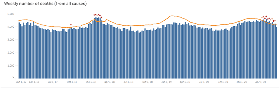
Thus far, Florida has not even reached the level of excess deaths that occurred during the 2018 flu season, according to the CDC.
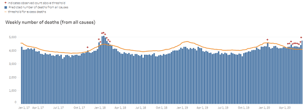
And here is what Texas looks like as compared to the 2018 flu season, even while importing some of Mexico's serious cases.
Thus, if the lockdown states in the Northeast and their defenders in the media are trying to give advice to the others, a polite but firm "no thank you" would be in order.