
ChakisAtelier/Getty Images
Whether it's forcing people to wear a mask on a Zoom call, while at home, or while having marital relations, wearing a mask is the new cult. No evidence is needed to force it upon us, and the more the virus spreads in areas that already mandated masks, the more they double down on their faith in the cloth. As such, it was only a matter of time before they fabricated evidence of its effectiveness. After all, they can't produce any unfabricated evidence.
On August 5, Kansas Department of Health Secretary Lee Norman tried to prove through a visual aid that the Kansas counties that followed the governor's mask mandate had fewer COVID-19 cases than the no-mask counties. Thanks to the Republican-dominated legislature, 90 out of Kansas' 105 counties were able to opt out of Democrat Governor Laura Kelly's mask mandate. Naturally, it was reasonable for Secretary Norman to try to ascertain which counties did better. What wasn't natural, however, was the manipulated chart he used to show the media that the mask counties did better, when in fact the opposite was true.
During the media briefing, Norman displayed the following chart on an easel. (This graphic has an added title line, "What Kansas Health Secretary Norman Gave to Media/Public.")
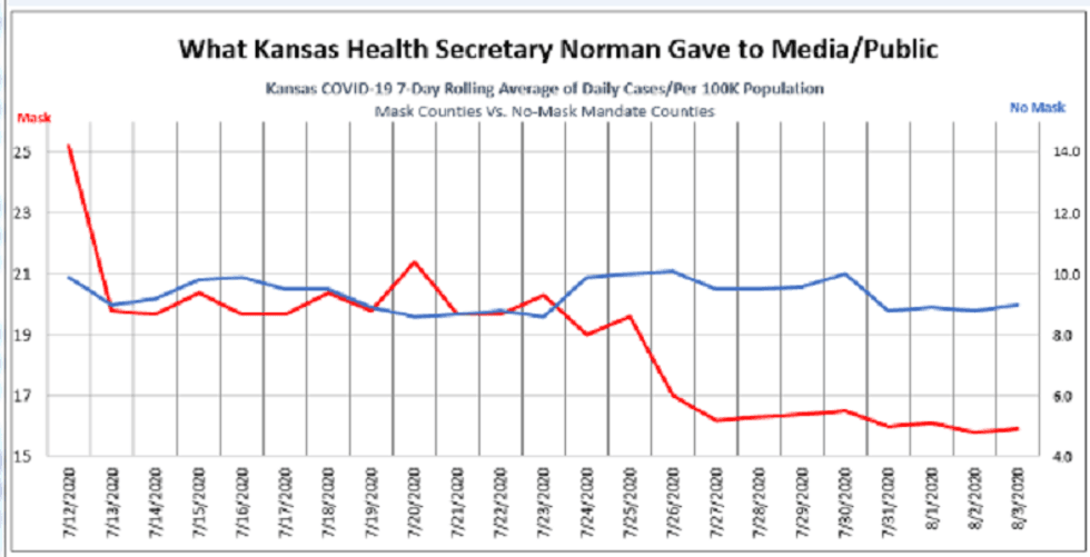
To the average person, the chart seems to clearly show the cases in mask counties, which are represented by the red line, plummeting from about 25 cases per 100K a day on July 12 to about 5 cases a day in early August. At the same time, the non-mask counties represented in blue appear flat and to land at about 9 per 100K in early August, clearly higher than the mask counties.
As KAKE reported, Michael Austin of the Kansas Policy Institute noticed something was off. He knew from the raw data that the non-mask counties had a lower case rate. Then he realized that this graphic was using two different x-axis lines in the same graph for the two categories. This explains why the chart depicts an impossible flat blue line for non-mask counties even though it appears to go down from 21 to 9. In fact, the cases for mask counties in red are based on the left axis, with a scale of 15 to 25, while those without mandates are based on a secondary axis on the right, with a scale of 4 to 14.
What does the chart look like if you actually placed them on the same axis to reflect the authentic case per capita data, as any honest person would do? Here is the chart Michael Austin sent me:
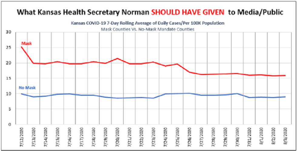
As you can see, while the mask counties did go down from about 25 to 15, they always remained higher to this day than the non-mask counties, which have flatlined at about 9-10 cases per 100K. In other words, those counties with mandates have about 77% more cases per capita per day than those without the mandate, yet the health secretary sought to depict the opposite.
It's not that Norman was just trying to show that mask counties had a relatively larger drop in cases. He was actually suggesting that mask counties had a lower rate at present in absolute numbers. At the 15-minute mark of the recording, a reporter asked if he believes that non-mask counties would be able to drop below the mask counties if they began wearing masks like good subjects. Norman replied, "I think it would." The problem is they are already below the mask county levels! They always had a flattened curve and never needed to flatten it.
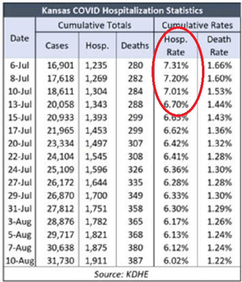
One might suggest that even though Secretary Norman was wrong about the rate of cases in mask counties dipping below those of non-mask counties, it still dropped at a relatively sharper pace than in non-mask counties. The problem with this analysis is that the rate of hospitalization was already dropping at least a week earlier in early July.
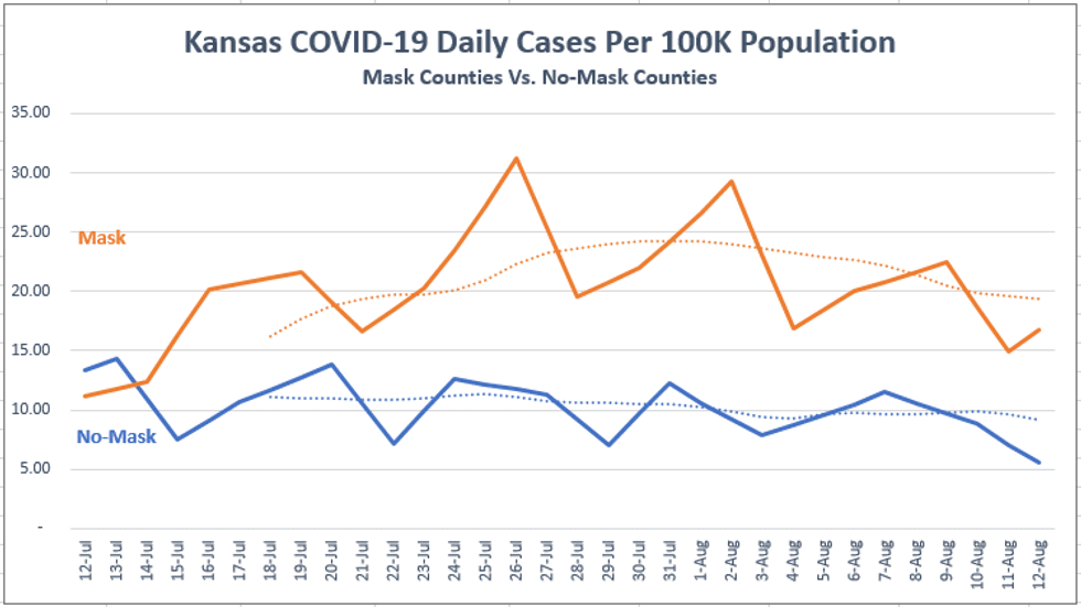
This was the story in every state that got hit earlier and then had another mild wave in June. It mainly hit the highly dense urban areas, the virus raged for about six weeks regardless of public policy, and then it started to decline. Whereas most rural, low-population-density counties around the country simply always had a low, flat curve, rather than a sharp peak. All of the non-mask counties are rural counties, but the largest urban areas, such as the greater Kansas City metro, Lawrence, Wichita, and Topeka, were all in counties that did not opt out of the governor's mask mandate.
As you can see below, the non-mask counties had roughly the same curve timing as the mask states, they peaked at the same time, and went down at the same time. The only difference is that the incline among the non-mask counties to begin with was lower, so naturally the decline is going to be milder. Isn't that the flat curve we were trying to achieve?
Thus, as we see today with the late-hit states in southern latitudes like Hawaii, the mandates in place for months didn't help prevent their peak in cases, and the states that got hit earlier before masking became cool began to decline before the mandate was in place. The virus does what the virus does.
Moreover, the non-mask counties actually did much better per capita than any of the data suggest because they have the anomaly of dealing with the meat-packing plants, one of the most vulnerable places for transmission in the country. Typically, rural counties have far fewer cases per capita than urban counties. However, Kansas has many agricultural processing interests with vulnerable facilities as well as vulnerable populations that have tested positive.
This is reflected in the astounding fact that 41 percent of all cases in Kansas where ethnicity has been confirmed are among Hispanics, even though they are just 11 percent of the state's population. Their case rate per capita is nearly six times that of non-Hispanics. This is clearly driven by the agricultural facilities.
Then again, you can't blame liberals for trying to manipulate data to demonstrate the effectiveness of their new religious symbol. As Swedish epidemiologist Anders Tegnell said, scientific evidence for mask-wearing to prevent COVID-19 is "astonishingly weak," and it is "very dangerous" to believe that face masks on their own could control the spread of the disease. And he would know. His country has now achieved in real life what the Kansas health secretary chose to fabricate on a chart, all without mandating masks.